App Screens Usability
Evaluated pre-release meal scheduling app to identify usability barriers in task flows and interface comprehension
Problem & Context
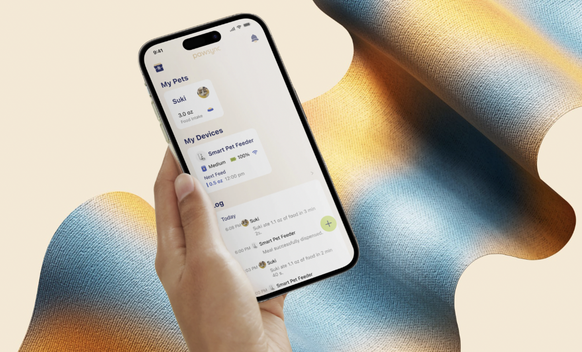
The design team had created multiple iterations of a meal scheduling interface for a new pet care app that would allow users to schedule and manage automated feeding times for their pets. There was uncertainty about whether users would understand how to set up, modify, and manage recurring feeding schedules. Previous internal testing suggested potential confusion around the recurring schedule modification flow, but the team lacked concrete data on where users were struggling and why.
My Role & Objectives
I worked alongside another UX researcher to execute on a tight timeline to recruit, create the research plan and script, and implement the study to:
- •Evaluate task completion rates for setting up initial feeding schedules
- •Identify usability barriers in the flow to modify recurring schedules
- •Gather qualitative feedback on the overall information architecture
Research
Approach
Moderated usability testing sessions with pet owners who matched our target demographic who were users of or were interested in smart pet devices. Each session lasted 60 minutes and included a series of realistic tasks followed by a semi-structured interview.
Methods
- •Task-based usability testing with think-aloud protocol
- •Screen recording and interaction tracking
- •Post-task difficulty ratings (1-7 scale)
- •Semi-structured follow-up interviews
Results
Key Findings
Users had no problem setting up feeding schedules, however, editing recurring feeding times was hard to find in a hidden menu. Average task completion time was 4.5 minutes (expected: 1-2 minutes).
"I feel like I should know how to do this, but I'm lost.. Where am I supposed to change the times again?" "It shouldn't take this long to make such a small change." "Why is the edit option hidden? I wouldn't think to look in a menu for something I want to change quickly."
What this reveals
If something looks like a card, users expect it to be tappable and editable directly, based on familiar mobile patterns from calendars, alarms, and reminders. Participants consistently tried to tap the schedule card itself when attempting to edit. If the edit option lived inside a secondary menu, users felt disoriented and uncertain.
Taxonomy distinction between 'pause' and 'skip next feeding' was unclear to 6 out of 8 participants.
"Wait…if I hit pause, does my pet miss a meal? That feels risky." "I'd be scared to press the wrong one and accidentally skip a meal."
What this reveals
Actions that involve pet well-being need to be crystal-clear for users to be able to build trust with the feeder. Not being able to distinguish between actions can carry emotional risk, in this case, missing a meal. App wording should have more descriptive labels, explanatory microcopy, or confirmation state that reassures users they're doing the correct thing.
Participants praised the clean visual design but wanted more prominent access to feeding history
"I'd love a quick way to check when the last feeding happened." "I'm constantly wondering, 'Did I feed them already?'"
What this reveals
Checking the history of feeding is a core emotional safety feature. It's part of how users check their own reliability when they can't remember to alleviate any doubts.
Impact
The design team implemented 3 critical changes before launch: moved the edit function to be directly accessible from schedule cards, redesigned the pause/skip interface with clearer labeling, and added a quick-access button for feeding history.
Interested in learning more?
I'd be happy to discuss this project in more detail or share additional case studies.
Get in Touch