Product Usability
Evaluated success rates and pain points across device assembly, water filling, and control panel interactions
Problem & Context
A new air purifier and humidifier combination device was in the final stages of development, ready for manufacturing. The engineering team was concerned that the unconventional design of a humidifier air purifier combo might create confusion during initial setup and routine maintenance with its many parts. Additionally, the control panel used iconography that had not been tested with end users.
My Role & Objectives
I worked independently to execute the study by creating a research plan, writing the script, and setting up the test environment to simulate real-life interactions alongside recording equipment in order to:
- •Assess ease of initial device assembly and setup
- •Test comprehension of control panel icons and interaction patterns
- •Identify any safety concerns or misuse patterns
Research
Approach
Conducted in-person moderated usability testing sessions in a home-like environment. Participants had varying levels of experience with smart home devices and were given the device in its retail packaging and asked to complete a series of realistic tasks while I observed and took notes. Each session lasted 90 minutes.
Methods
- •Unboxing and setup observation
- •Task-based usability testing with physical product
- •Think-aloud protocol during interactions
- •Post-task questionnaires
- •Video recording of interactions for detailed analysis
Results
Key Findings
83% of participants successfully assembled the device on first attempt, but 4 participants initially inserted the filter incorrectly
"I thought it clicked in this way… that's not right?"
What this reveals
Users rely on tactile confirmation when assembling components. When the product doesn't communicate how it wants to be handled, users second-guess themselves. Clearer affordances, like a notch, click, or directional marker, would reduce confusion and build confidence during setup stages.
The water reservoir was hard to hold for filling, with participants rating it 2.8/5 for ease of use
"It's getting heavier as it's filling with water. I'm scared I'm going to drop it or something cause there's no good way for me to hold it." "I feel like someone with smaller hands might struggle with holding this cause there's not really a firm grip that I can find."
What this reveals
The reservoir feels physically awkward which creates a safety and confidence issue for users who fear dropping or spilling the component. The reservoir needs ergonomic support like obvious grip points, grippier or lighter materials, or a structure that reduces strain like a handle to work for varying hand sizes and arm strengths.
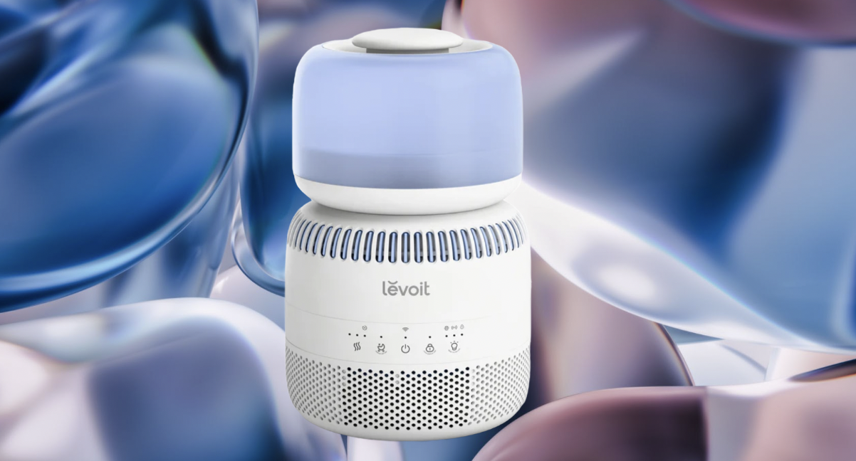
Control panel icon of a baby crib for 'sleep mode' was not clear for 58% of participants
"Is that supposed to be sleep mode? I'm not sure why a baby crib is necessary. Adults sleep too."
What this reveals
Users can feel alienated when they don't identify with a niche reference to a universal behavior. Universal iconography for Sleep mode like a moon or Zzz are more intuitive.
3 participants attempted to clean the device while it was still plugged in, suggesting a need for clearer safety messaging
"Oh, should I unplug it first?" "I almost started washing it with the cord still in. I didn't think about the power at all."
What this reveals
Users treat cleaning as a familiar household task, not as a 'technical' action so they don't instinctively shift into device safety mode during this step. The product should proactively communicate danger at the exact moment users are likely to act to include: a visible 'Unplug before cleaning' label, a physical design that encourages unplugging, or an in-app safety prompt.
Impact
The engineering team added tactile guides to the filter housing to prevent incorrect installation, and considered a different material for the water reservoir. The control panel icons were redesigned with more intuitive symbols, and labels were added for the first production run. Safety warnings were made more prominent in both the quick start guide and on the device itself.
Interested in learning more?
I'd be happy to discuss this project in more detail or share additional case studies.
Get in Touch